Configuration
The following parameters are accepted by the widget. Note that the apikey and topicid are the only required parameters.
| Argument | Description | Note |
|---|---|---|
apikey | API key to authenticate your website | Required. See our Getting Started page for details on how to get one. Note: please do not try to copy the API key we use for example purposes on this website. It will not function correctly for your website. |
topicid | ID of a topic | Required. The transformation map correpsonding to that topic that you want to display. The topicid can be found for any given topic by examining the URL at https://intelligence.weforum.org and you will find they correspond to the following format: https://intelligence.weforum.org/topics/topicID, for example https://intelligence.weforum.org/topics/a1Gb00000015HiiEAE. In this example, a1Gb00000015HiiEAE is the topicid and hence can be passed as a parameter to the widget as follows: topicid="a1Gb00000015HiiEAE" |
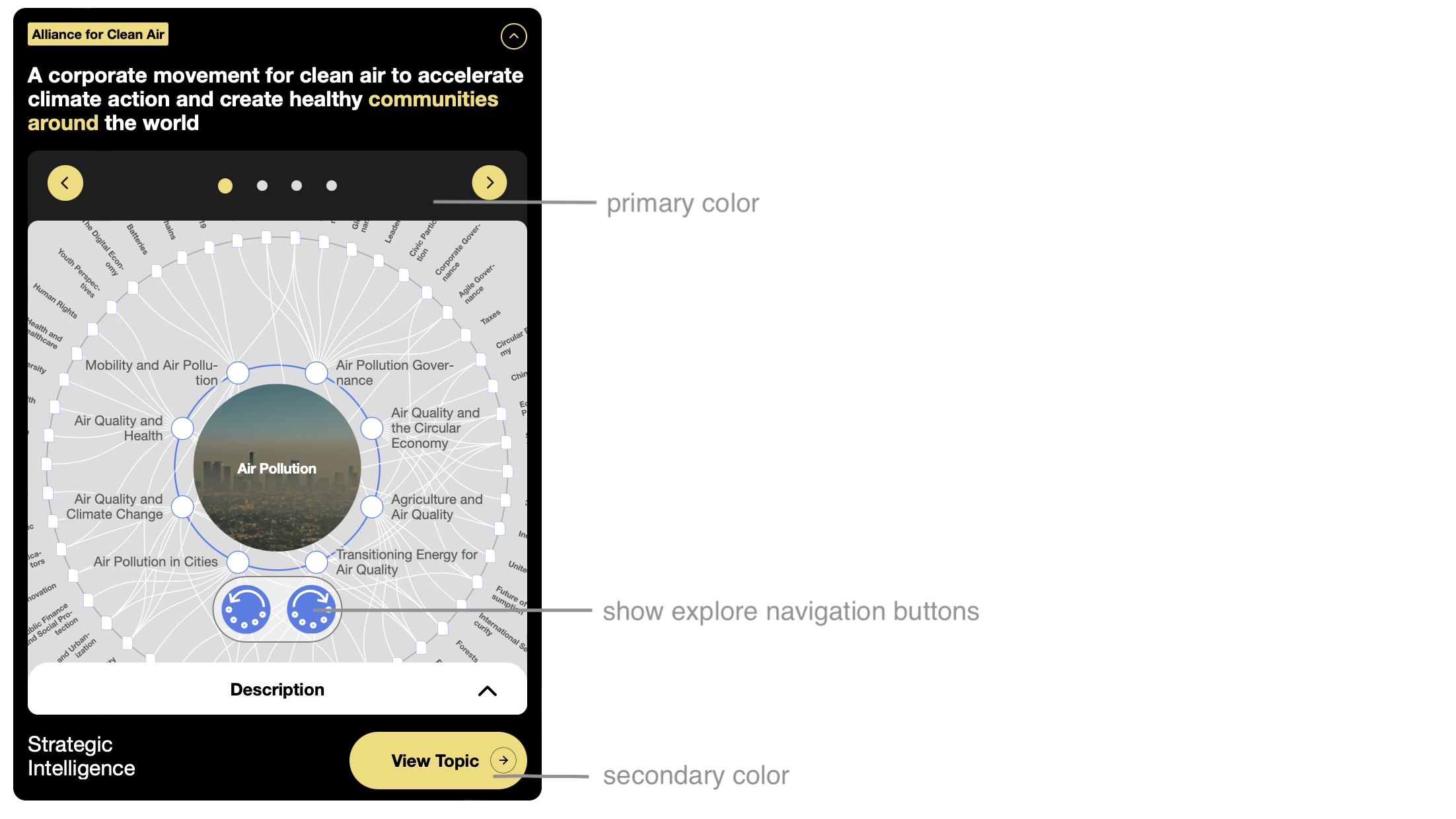
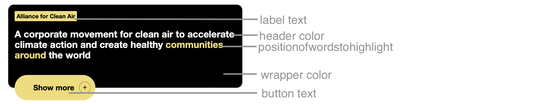
labeltext | The text in the widget label | This is the text that goes in the upper label of the widget. See the relating image to see where the label is located. This expects a normal string, e.g. labeltext="I am label text" |
headertext | The text in the widget header | This is the text in the main label of the widget. See the relating image to see where the header is located. This expects a normal string, e.g. headertext="I am header text" |
buttontext | The text in the collapsed widget button | This is the text in the collapsed versions button. This expects a normal string, e.g. buttontext="I am button text" |
iscollapsable | Choose whether the widget can be collapsed | Not supported in the iframe version! This decides whether the widget can be collapsed or not. This defaults to be be false. This expects a boolean as a string, e.g. iscollapsable="true" |
isinitialisedcollapsed | Choose whether the widget should be collapsed initially | Not supported in the iframe versions! This decides whether the widget will be collapsed initially or not. This defaults to false. If iscollapsable="false", the value passed here will be ignored. This expects a boolean as a string, e.g. isinitialisedcollapsed="true" |
positionofwordstohighlight | The words in the title to highlight | This value gives the option to highlight certain words in the header text, if wanted. It is 0 indexed, meaning that the first word is counted as 0, the second as 1 etc. This expects an array passed as a string, e.g. positionofwordstohighlight="[0,3,4]" |
initialindex | The index of the first page to show | This represents the first page that will be shows when the widget loads. This value is 0 indexed, meaning that the first slide (with the map on it) it number 0. This value defaults to 0. It expects a number passed as a string, e.g. initialindex="2". The permitted values are, "0", "1", "2", "3" |
showexplorenavigationbuttons | Choose whether the widget shows navigation buttons on the transformation map | This represents whether you want the exploration buttons for navigating the transformation to show or now. The map can still be navigated by clicking on it. This value defaults to true. This value expects a boolean passed as a string, e.g. showexplorenavigationbuttons="false" |
language | Choose which language the content should be in | This will set the language of the topic map, and headers/ text seen in the widget. It does not guarantee that the articles presented will only be in this language however. Supported languages are "en", "pt", "zh", "es", "ja", "ar", "fr", "de", "hi" and "ko". Defaults to "en" |
mode | Choose which mode to show the widget it | This value can either be "auto", narrow", "normal" or "wide". It defaults to "auto". If set to auto mode, it will decide itself which mode to put itself into, depending on how much width it is given. This value expects a string, e.g. mode="wide" |
wrappercolor | The colour you want the wrapper to be | This value must be a valid colour, e.g. wrappercolor="red" or wrappercolor="#ffffff". See the relating image to see which colour is being referred to here |
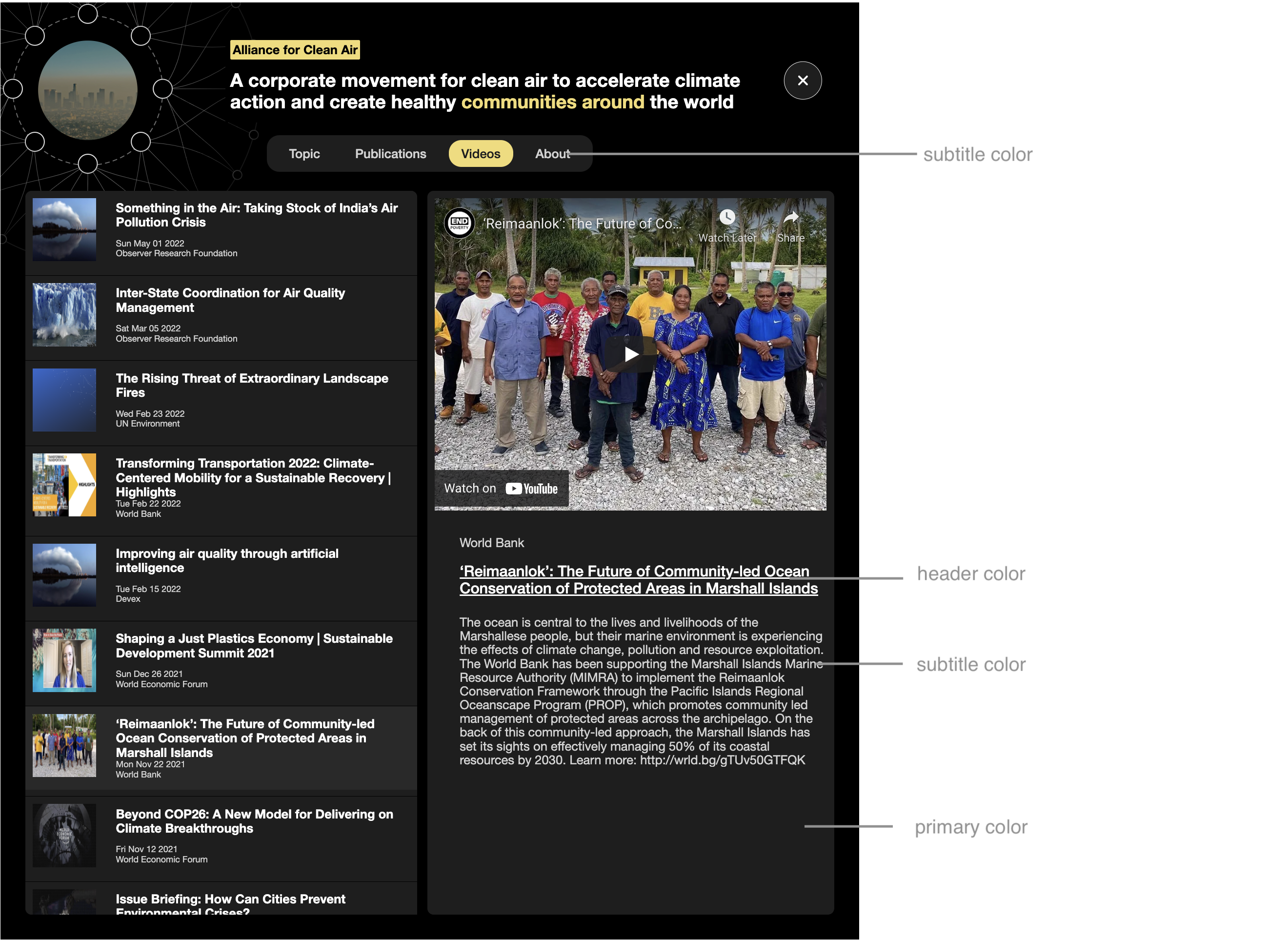
primarycolor | The colour you want as the primary colour | This value must be a valid colour, e.g. primarycolor="red" or primarycolor="#ffffff". See the relating image to see which colour is being referred to here |
secondarycolor | The colour you want as the secondary colour | This value must be a valid colour, e.g. secondarycolor="red" or secondarycolor="#ffffff". See the relating image to see which colour is being referred to here |
tertiarycolor | The colour you want as the tertiary colour | This value must be a valid colour, e.g. tertiarycolor="red" or tertiarycolor="#ffffff". See the relating image to see which colour is being referred to here |
headercolor | The colour you want as the header colour | This value must be a valid colour, e.g. headercolor="red" or headercolor="#ffffff". See the relating image to see which colour is being referred to here |
subtitlecolor | The colour you want as the subtitle colour | This value must be a valid colour, e.g. subtitlecolor="red" or subtitlecolor="#ffffff". See the relating image to see which colour is being referred to here |
fontfamilysrc | The place where your fonts can be downloaded from. Currently only supports woff2 | This value must be the string from where your fonts can be downloaded. We currently only support the use of one woff2 font. The fonts will default to Helvetica Neue. This expects a string pointing to the fonts, e.g. fontfamilysrc="https://fonts.gstatic.com/s/roboto/v30/KFOkCnqEu92Fr1MmgVxFIzIXKMnyrYk.woff2" |
hideframe | Toggle between the framed and frameless version of the widget | This is a boolean value. Defaults to false. This option can only be enabled with specific API tokens that provide this feature; if not requested, then this parameter will revert to the default value. |
Styles
The styles of the widget can be altered quite considerably using the parameters above. Here is an index of the different parameters.